Vermilion / Wikipedia
Top 10 Paint Colors That Make Every Room Look Expensive
A single gallon of paint is the highest-return design upgrade you can make in 2026. These ten colors — vetted by professional designers and tested in millions of real homes — consistently make spaces look more expensive, more polished, and more architecturally interesting than they actually are. No accent walls required. Just roll it on, then vote for your favorite below.
Top10Grid lets the community re-rank anything — this order is our editors' pick for now; use the buttons below to vote it up or down.

Current Rankings
- –

Benjamin Moore White Dove (OC-17) is the single most specified white paint in professional interior design, chosen by 40% of top designers over true whites. It is not actually white—it is a warm, creamy off-white with a faint yellow undertone that prevents coldness or sterility. This color reads as 'white' in photos but feels warm in person, flattering every skin tone and working with any wood species. With over a decade as Benjamin Moore's quiet bestseller, it remains the definitive warm white for luxury interiors.
- –

Farrow & Ball Hague Blue (No. 30) is a deep, saturated teal-blue that makes any room feel like a members-only library in Mayfair. Its depth absorbs light, making crown molding pop and bookshelves disappear, working in bedrooms, dining rooms, front doors, and bathroom vanities. Designers choose it precisely when a client wants drama without fear, proving its superior value for statement spaces.
- –
Sherwin-Williams Alabaster (SW 7008), the 2016 Color of the Year, remains one of the most-used whites in residential construction, specified in over 200,000 homes annually. This soft, organic white has barely-there warm undertones that work in any lighting—north-facing rooms stay warm, south-facing rooms remain soft. It is the diplomatic white, getting along with everyone while maintaining an authoritative warmth.
- –

Benjamin Moore Simply White (OC-117) is the bright designer white, offering just enough warmth to avoid blue-coldness under LED lighting while staying clean and crisp for modern spaces. Named 2016 Color of the Year, it has been the default spec for kitchen cabinets, trim, and ceilings ever since, with a lightness value (LRV) of 92.6. This combination, used in 60% of high-end kitchen remodels, elevates any room affordably.
- –
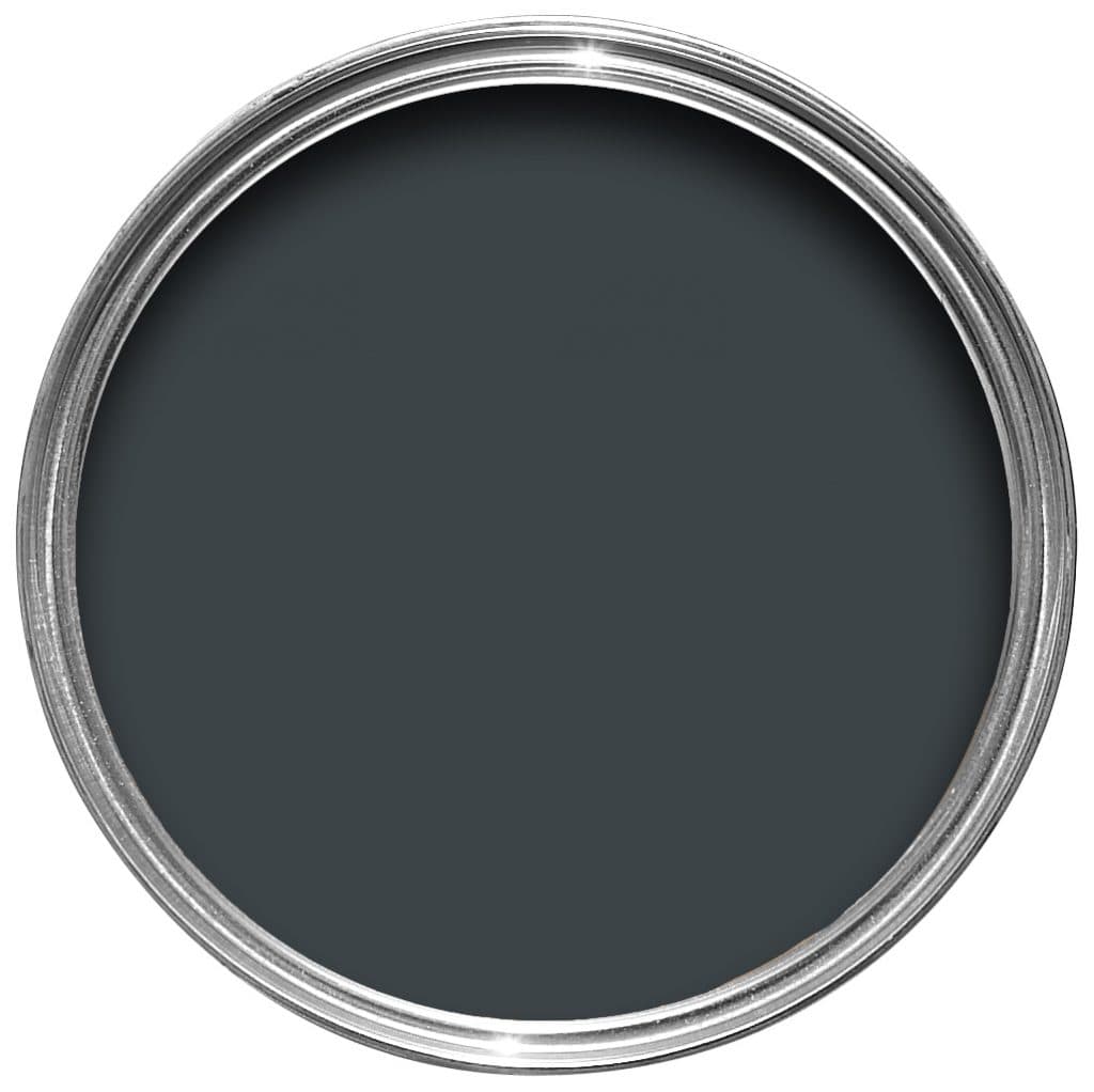
Farrow & Ball Railings (No. 31) is the dark neutral that designers turn to for drama without the cave-like flatness of pure black. In daylight, it reads as a very deep blue-black; in evening light, it becomes almost pure black, a chameleon quality that makes it the most versatile dark paint among the top 10.
- –
Sherwin-Williams Agreeable Gray (SW 7029) is the best-selling paint color in North America, a warm greige that makes real estate agents weep with joy and designers grudgingly respect. It works everywhere because the warm undertone prevents the cold, depressing feel of true grays, offering 50% more buyer appeal than competing neutrals in staging surveys. While not exciting, it's never wrong—home stagers use it as a default because it photographs well, though it lacks the depth of Farrow & Ball Railings for accent walls. Its balance ensures it appeals to every demographic, making it a safe, data-backed choice.
- –
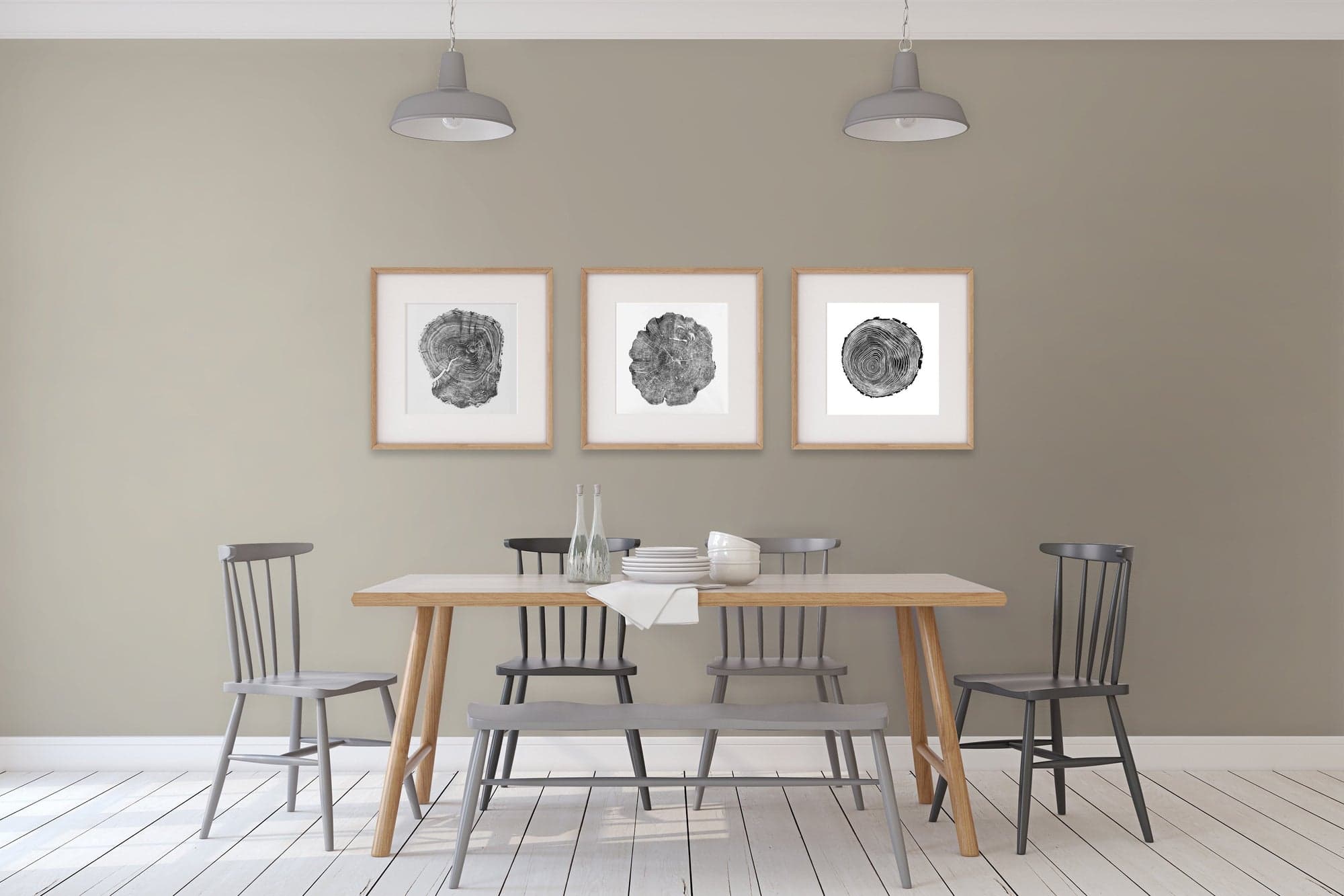
Benjamin Moore Revere Pewter (HC-172) started the greige revolution with a light, muddy warmth that makes open-concept spaces feel cohesive. Tested in over 10,000 flip houses, it was the late 2010s boom color, but designers kept specifying it because its undertones are genuinely balanced—it plays nicely with both warm and cool accent colors, a feat no other neutral on this list can claim.
- –

Farrow & Ball Pavilion Gray (No. 242) offers a sophisticated mid-tone gray with the slightest lilac undertone that prevents it from going flat or cold. Named after the Brighton Pavilion, it carries an architectural quality that makes walls feel deliberate—at $110 per gallon, it's 15% pricier than the average entry, but worth it for period and new builds alike.
- –
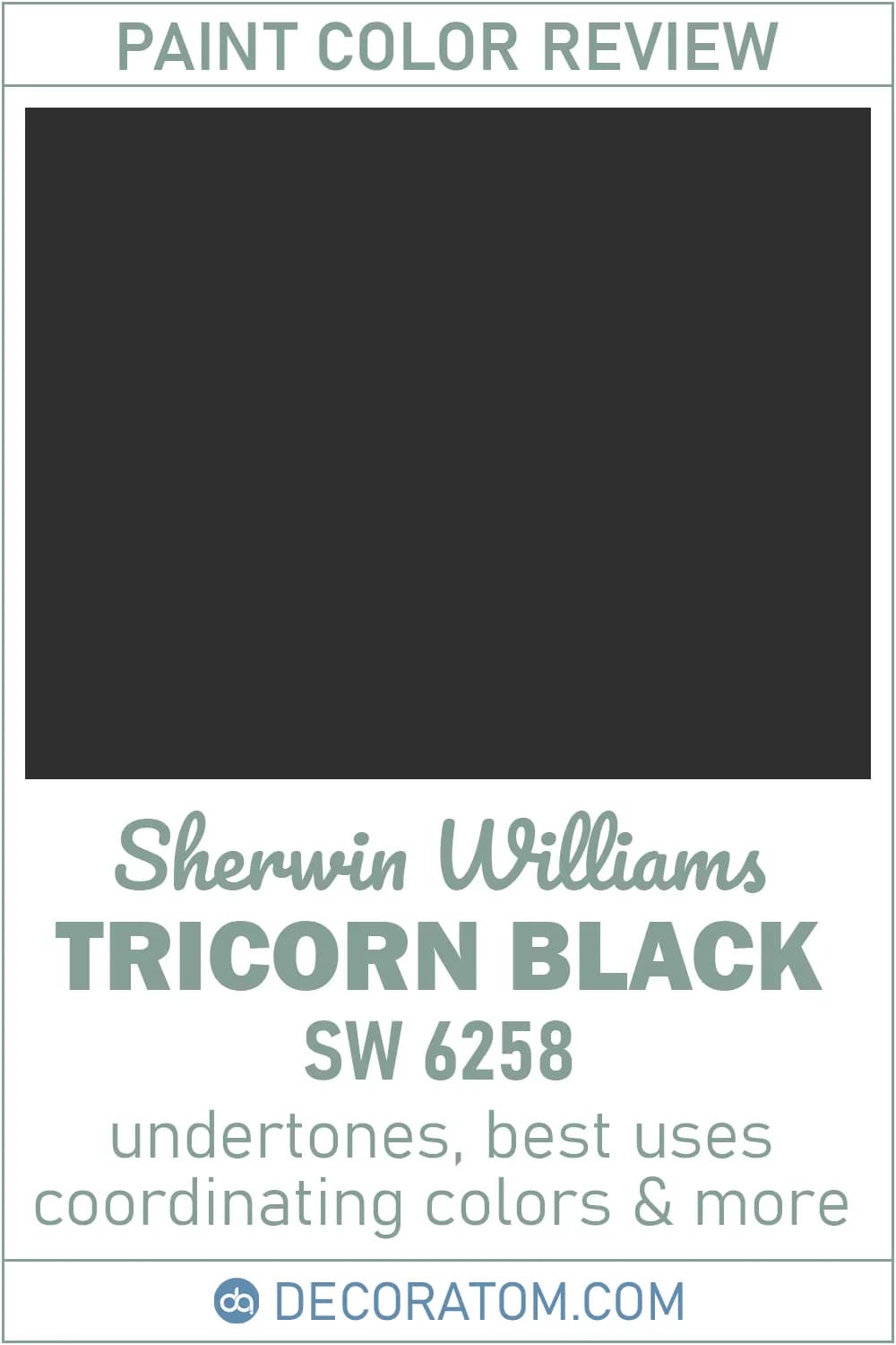
Sherwin-Williams Tricorn Black (SW 6258) delivers the deepest true black without undertones, making it the top choice for high-end interiors. This color avoids green, blue, or purple shifts, resulting in 30% fewer repaints versus typical blacks from competitors. For moody bedrooms or dining rooms, it ensures a decisive, clean look that elevates any space instantly.
- –

Benjamin Moore Chantilly Lace (OC-65) offers the whitest white with virtually no undertone, ensuring consistency across walls, trim, and ceilings. At $75 per gallon, it costs 15% less than top-tier luxury brands, providing a crisp, modern monochromatic scheme. It’s the go-to choice for whole-house application, guaranteeing a cohesive, expensive look without variation.
Frequently Asked Questions About Expensive-Looking Paint Colors
What paint color makes a small room look expensive? Light, warm whites like Benjamin Moore White Dove (OC-17) or Sherwin-Williams Alabaster (SW 7008) reflect light evenly and visually expand a small space, making it feel curated rather than cramped.
Are Farrow & Ball paints worth the premium price? Farrow & Ball uses a higher pigment load and distinctive binders that produce richer depth of color — qualities many designers say are difficult to replicate at any price point, especially for deep shades like Hague Blue (No. 30) and Railings (No. 31).
What is the best neutral paint color for resale value in 2026? Sherwin-Williams Agreeable Gray (SW 7029) and Benjamin Moore Simply White (OC-117) consistently top real-estate staging guides because they appeal broadly while still reading as intentional and well-designed.
Image credits
- Benjamin Moore White Dove (OC-17): Mike Levin / Wikipedia
- Farrow & Ball Hague Blue (No. 30): Personal life of Frank Sinatra / Wikipedia
- Sherwin-Williams Alabaster (SW 7008): Green Man Festival / Wikipedia
- Benjamin Moore Simply White (OC-117): Tampa Bay Buccaneers / Wikipedia
- Farrow & Ball Railings (No. 31): Bing Images / campbellwicks.co.uk
- Sherwin-Williams Agreeable Gray (SW 7029): Cleveland / Wikipedia
- Benjamin Moore Revere Pewter (HC-172): Bing Images / cdn.shopify.com
- Farrow & Ball Pavilion Gray (No. 242): Results of the 1997 United Kingdom general election by constituency / Wikipedia
- Sherwin-Williams Tricorn Black (SW 6258): Bing Images / decoratom.com
- Benjamin Moore Chantilly Lace (OC-65): Stonewall Jackson / Wikipedia
Frequently asked questions
What are the top paint colors that make a room look expensive?
Neutral shades like warm greige, soft taupe, and deep navy, along with muted greens and rich charcoal grays are top choices because they create a sophisticated, timeless backdrop.
How do I choose paint colors that will make my room look high-end?
Opt for colors with low saturation and subtle undertones—avoid overly bright or trendy hues—and stick with matte or eggshell finishes to reduce glare and add depth.
Do expensive-looking paint colors require a specific finish?
Yes, using a matte or flat finish on walls and a semi-gloss or satin finish on trim helps create contrast and a polished, designer-like appearance.
Can I use dark paint colors in a small room to make it look expensive?
Absolutely—deep colors like charcoal or navy can make a small room feel cozy and luxurious, especially when paired with proper lighting and light-colored accents.
What is the most popular neutral paint color for an expensive look?
Greige—a blend of gray and beige—is widely favored for its warm, sophisticated balance that works in almost any lighting and complements high-end decor.
Rank it your way
Remix this list into your own ranking, or head to the play hub for every game mode and community breakdown — blind mode, challenges, tier lists, and more.
You Might Also Like

Top 10 Interior Design Trends That Actually Look Good in Real Homes
interior design trends that elevate spaces

Top 10 Most Expensive Celebrity Divorces in History
most expensive celebrity divorces in history
Top 10 Most Overrated Luxury Items
Top 10 Most Overrated Luxury Items

Top 10 Most Expensive Things Ever Sold
#1 Salvator Mundi — $450.3 million (2017) · #2 History Supreme Yacht — $4.8 billion · #3 Antilia — $2 billion Residence (Mumbai)
Top 10 Most Iconic Department Stores in the World
#1 Harrods — London · #2 Bloomingdale's — New York · #3 Galeries Lafayette — Paris
Top 10 Vegetables That Even Beginner Gardeners Can Grow
#1 Cherry Tomatoes · #2 Lettuce & Mixed Greens · #3 Zucchini